.png)


When you invest in a brand system, you should know precisely what you're getting. This post breaks down every deliverable, phase by phase, so there's no ambiguity — just clarity.
A Brand System is a complete brand foundation for technical B2B companies, combining positioning strategy, messaging, visual identity, and practical documentation in a single, fixed-scope engagement.
Six weeks from now, your team will be able to describe what you do in one sentence. Your sales deck will look like it belongs in the same room as your product. And you'll have a brand that works before the first call with a prospect, not after.
Here's what's included, in the order it gets built.
Discovery workshop
Everything starts with a structured session with your founding team and key stakeholders. Typically two to three hours, remote or in person, with whoever knows the business best: the CEO, the founding team, sometimes a head of sales or marketing if they're close to the buyer conversation.
We're not here to listen to a pitch. We're here to extract the positioning insights that already exist inside your business but haven't been articulated clearly yet. Who is the right buyer, specifically? What problem are you solving that others aren't? Where do you win, and where do you lose? What do your best clients say that your website doesn't?
By the end of the workshop, the strategic foundation for the entire project is clear. Every decision made after this point connects back to what came out of this session.
Most brand projects skip this entirely. That's why most brand projects deliver something that looks considered but communicates nothing.
Positioning and messaging
From the workshop, we produce a concise positioning document. This is the written foundation the entire visual identity is built on. If it's weak, everything built on top of it is weak too.
The document includes:
- Positioning statement: a single, precise definition of what you are, who you're for, and why it matters. Short enough to say in a meeting. Strong enough to hold up under pressure.
- Value proposition: the commercial case for choosing you, in plain language. Not a tagline. Not a mission statement. A clear explanation of the outcome you deliver and why that outcome is worth paying for.
- 3–5 messaging pillars: the core themes that structure every piece of communication your company produces. Your website, your deck, your sales conversations, your recruitment materials. When these are defined, your team stops saying different things to different people.
- Tone of voice: defined with annotated examples, not a list of adjectives. Adjectives don't help anyone write anything. Examples do.
This document is shared with you in full before any visual work begins. You review it, push back if something is wrong, and sign off before we move forward.
Creative direction
Before a single logo sketch or colour palette is developed, we present 2–3 distinct creative directions.
Each direction is a fully reasoned proposal, not a mood board of images we found online. It includes a written rationale explaining the strategic logic behind the visual approach, an initial colour palette, a typographic direction, and a visual language reference. Each one is designed to be genuinely different, so you're making a real choice, not picking between variations of the same idea.
Critically, each direction is grounded in your positioning. We explain why it fits your sector, your buyer, and the competitive space you're operating in. You're not just deciding what looks right. You're deciding what communicates correctly.
You choose the direction that's right. We then develop it into the full identity system.
Visual identity system
Once a direction is confirmed, we develop a complete, resolved visual identity. Not a starting point. Not a set of files that need further interpretation. A finished system ready to deploy.
- Logo or logotype: designed for the contexts that matter most in B2B, digital-first, legible at small sizes, coherent across light and dark backgrounds. We deliver master files in every format you'll need.
- Colour system: a primary and secondary palette with clear rules for how each colour is used and when. Not just the hex codes. A logic for the system so anyone applying it makes the right call.
- Typography: a typographic system that works on the web, in documents, in decks, and in marketing materials. We specify primary and secondary typefaces, hierarchy rules, and size guidance.
- Visual language: the supporting elements that give a brand its texture. This includes graphic devices, layout principles, icon style if relevant, and image and photography direction. These are the elements that make a brand feel coherent across formats without needing the logo visible in every corner.
Technical B2B markets have specific visual codes. What communicates authority and trust in cybersecurity is different from what communicates innovation and precision in SaaS. What works for an energy infrastructure company is different from what works for a telecoms software platform. The identity is designed for your sector, not adapted from a template.
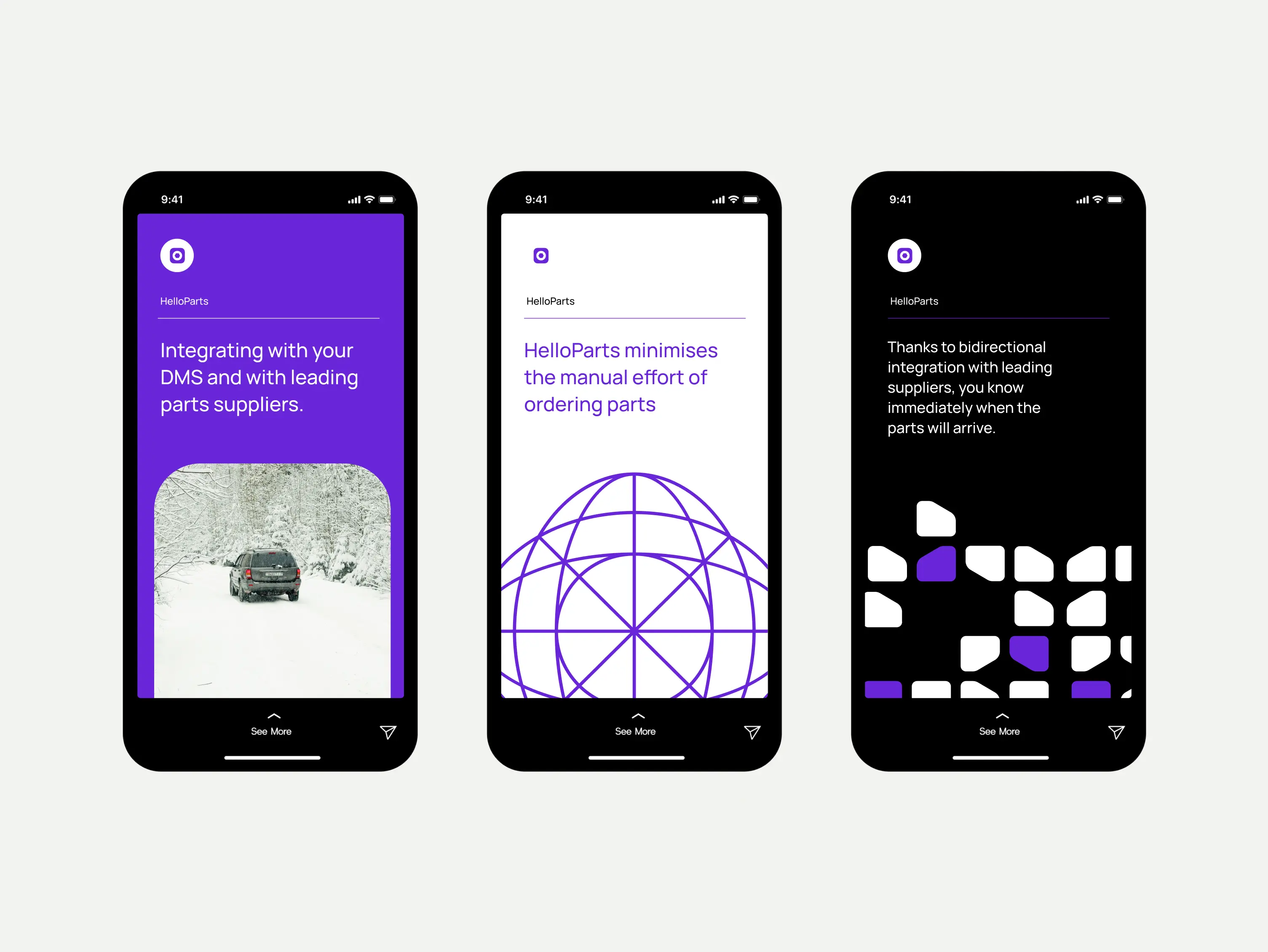
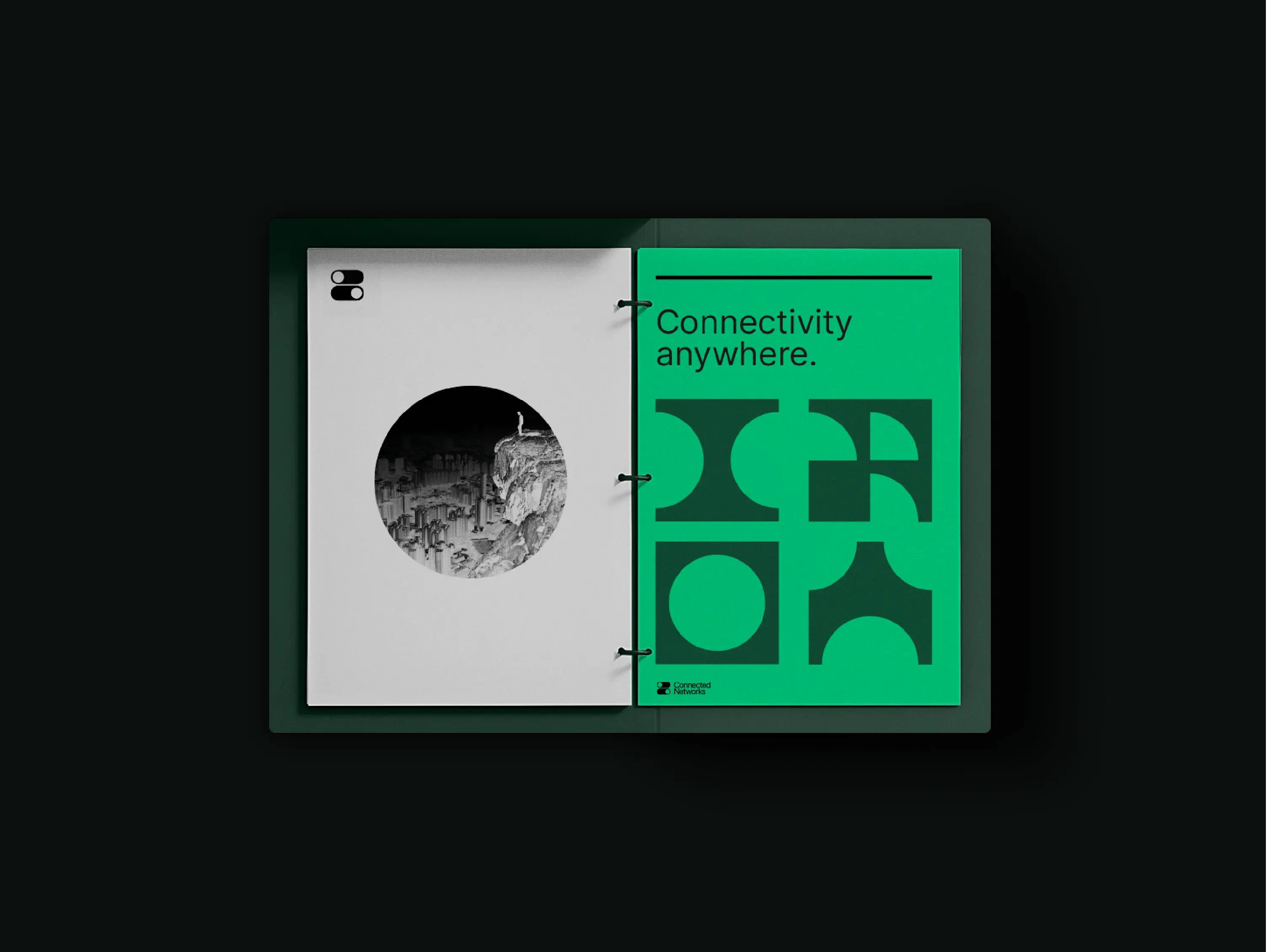
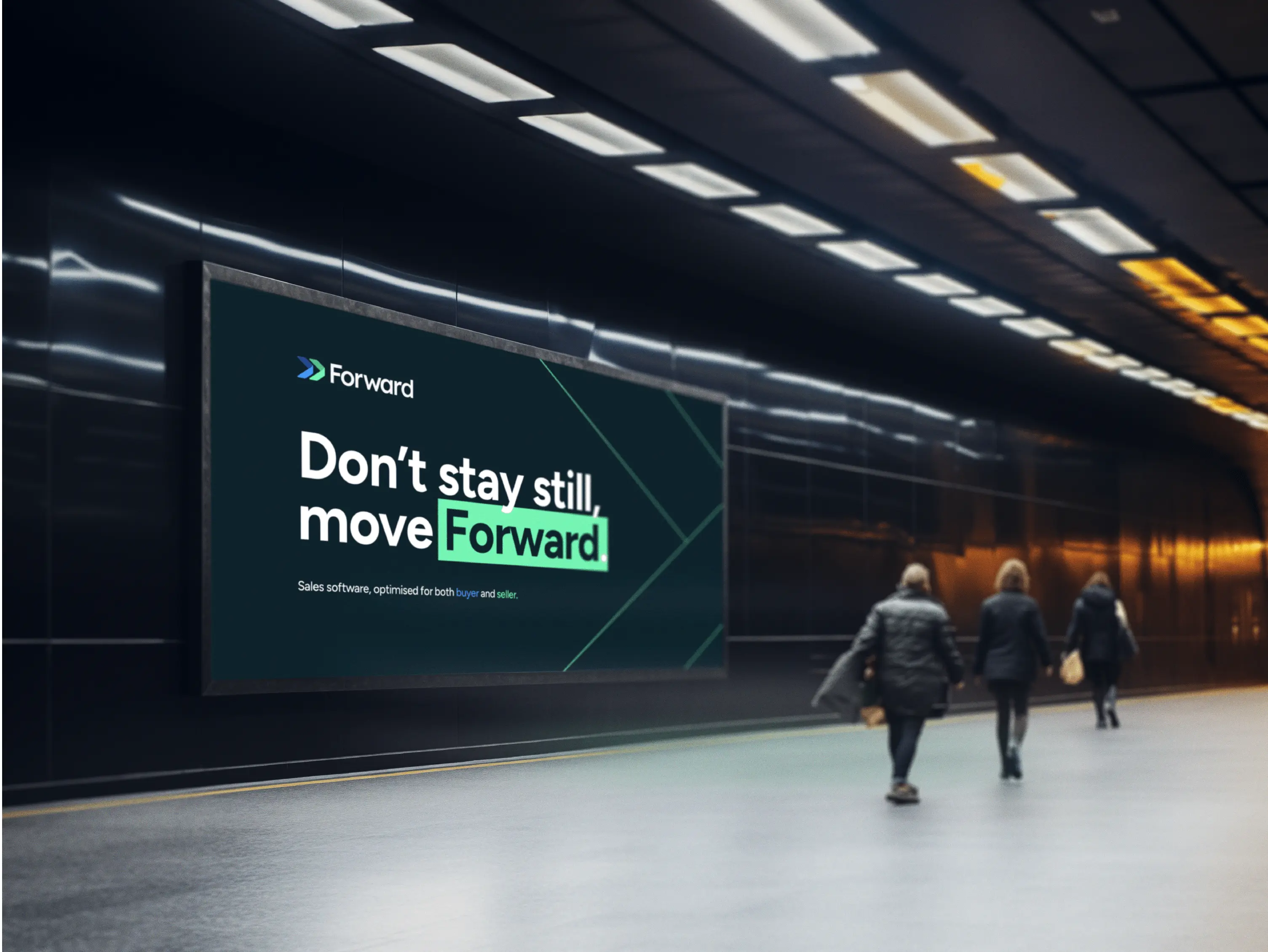
Brand in application
A brand that only exists in a guidelines document doesn't exist. Knowing the rules isn't enough. Your team needs to see the system working.
Every Brand System includes the identity applied to the commercial outputs that matter most in a B2B context:
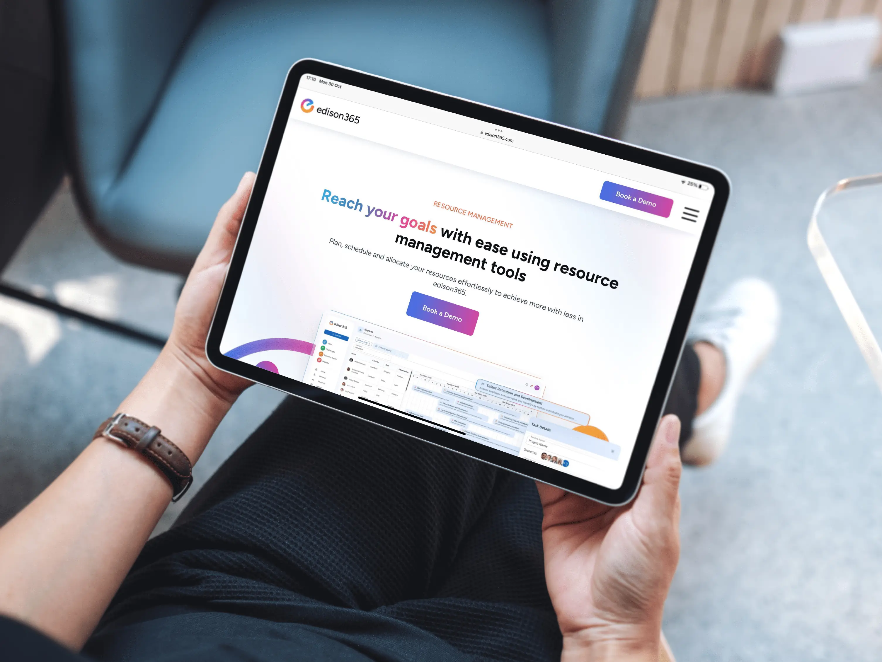
- Website direction: a visual and structural blueprint for your core pages. This isn't a full website build, but it establishes the layout logic, content hierarchy, and visual application across your homepage and key service pages. Your developer or web team gets a clear brief, not a set of assets and a guess.
- Sales deck styling: the visual system applied to your most-used commercial asset. This covers master slide templates, cover layouts, section dividers, data visualisation style, and typography rules. Your team can build and update the deck without it drifting from the brand.
- Social and marketing visuals: a set of applied examples showing how the identity scales across LinkedIn posts, event graphics, email headers, and other marketing formats. This proves the system works beyond the core deliverables and gives your team a reference point for everything produced after handoff.
This is the step most agencies skip. It's why their deliverables end up in a drawer two weeks after delivery.
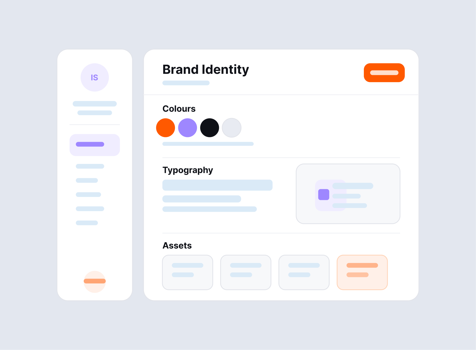
Brand guidelines document
The final document is approximately 30 pages. It's structured to be used, not filed.
It covers every component of the identity system with clear rules, annotated examples, and practical guidance for common use cases. The sections include:
- Brand overview and strategic context, so anyone reading it understands what the brand stands for and why it was built the way it was
- Logo usage rules: correct sizes, clear space, colour versions, placement, and what not to do
- Colour system: palette reference, usage logic, accessibility guidance
- Typography: full hierarchy, web and print specifications, examples in context
- Visual language: graphic elements, layout principles, image direction
- Applied examples drawn directly from the application stage
The benchmark is simple: someone who wasn't in a single workshop or briefing session should be able to pick this document up, read it, and get the brand right. That means your next marketing hire, your development agency, your PR team, or any creative partner you work with after this engagement.
Handoff and support
Delivery isn't the end of the engagement. It's the point where the risk of misapplication is highest.
The handoff process is designed to make sure the brand is actually used correctly once it leaves our hands:
- Recorded walkthrough: a full video walkthrough of the brand system, covering every section of the guidelines document and the logic behind key decisions. Available for your team to reference at any point after delivery.
- Live handover session: a dedicated call where we walk through the complete system together, answer questions, and make sure everyone who'll be working with the brand understands how to use it. Typically one hour, with your relevant internal team and any external partners involved in implementation.
- 1–2 weeks of async support: after handoff, questions come up. Files need adjusting. Edge cases appear that weren't covered in the guidelines. This window covers all of that without a new scope or a new invoice.
The brand doesn't degrade the moment it leaves our hands. That's the point of this stage.
Optional extras
Once the core system is in place, some clients choose to extend it. These are not things you need on day one, but they become valuable once the foundation is proven and you're ready to build on it.
- Full website design and build: strategy, UX, page flows, UI design, and a clean handoff to development. This is the most common next step after a Brand System, and the project where the positioning and visual work pays the clearest commercial return.
- Sales and investor decks: full design for your most commercially critical assets. This goes beyond the deck styling included in the core system, covering a complete master deck built around your messaging, with slide structures for different audiences and use cases.
- Extended brand guidelines: advanced use cases, edge scenarios, naming architecture, and audience-specific messaging layers for companies with multiple products, sub-brands, or distinct buyer segments.
- Marketing system extensions: a full visual system for ongoing marketing activity, including social media templates, campaign frameworks, ad creative direction, and content templates. Built so your team can execute at scale without every piece needing to come back to a designer.
- Product and technical visualisation: system architecture diagrams, product interface explainers, process flows, and technical graphics. Particularly relevant for SaaS and cybersecurity companies where the product is complex and standard photography or stock imagery won't communicate what it does.
- Ongoing design support: pre-purchased hours of senior design work, available through our Time Blocks product. Suited to companies that have a strong brand in place and need consistent execution support without the overhead of a full-time hire or a retainer agency relationship.
Is a Brand System right for you?
This engagement is built for technical B2B companies in SaaS, cybersecurity, energy, and telecoms, where the product is strong but the brand isn't generating the commercial return it should.
The clearest signal is a gap between the quality of your product and the quality of your brand. If your team can't describe what you do in a single sentence, if you're losing deals to competitors with inferior technology, or if your brand looks like it hasn't been touched since the company launched, a Brand System is the right place to start.
Define how your company is understood